Oxymore
description
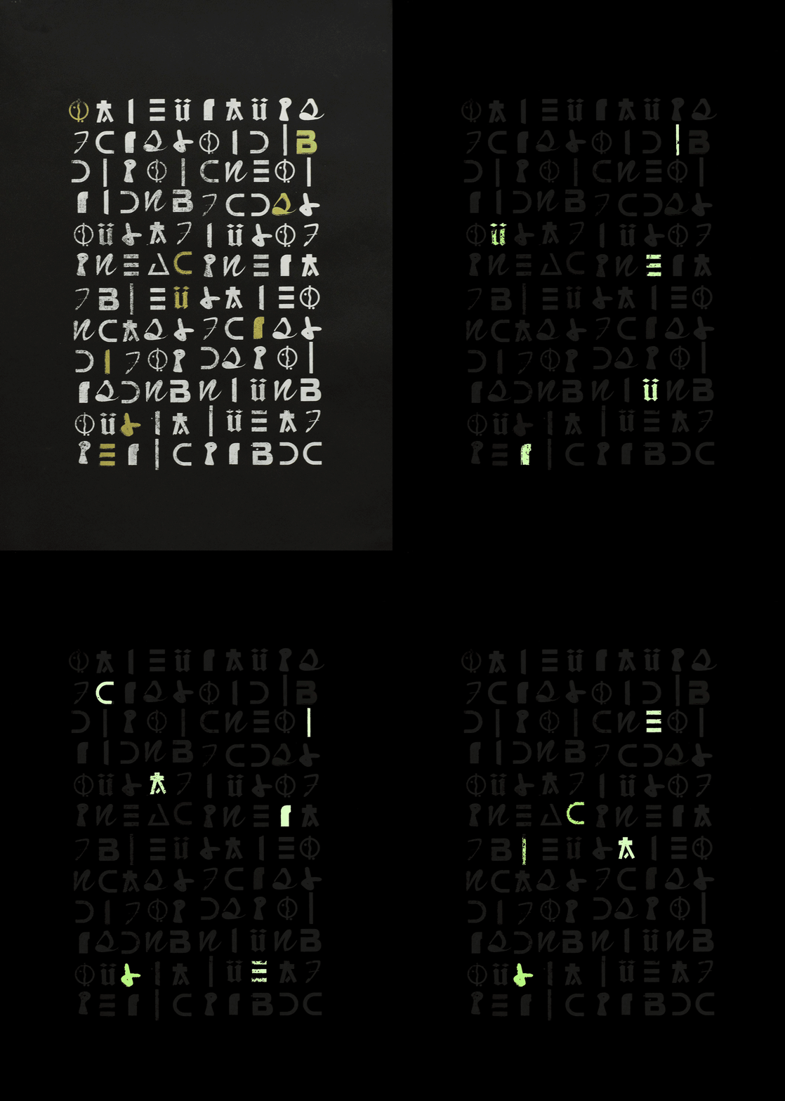
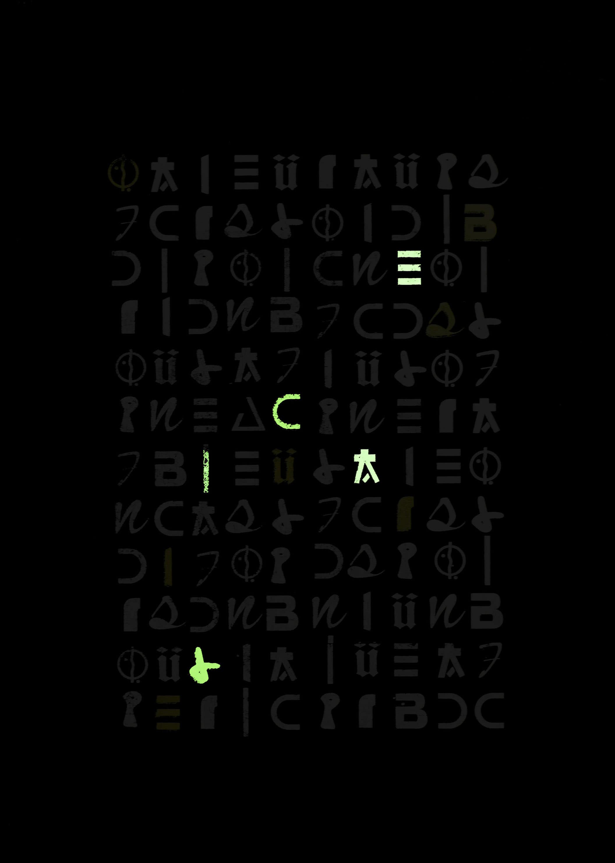
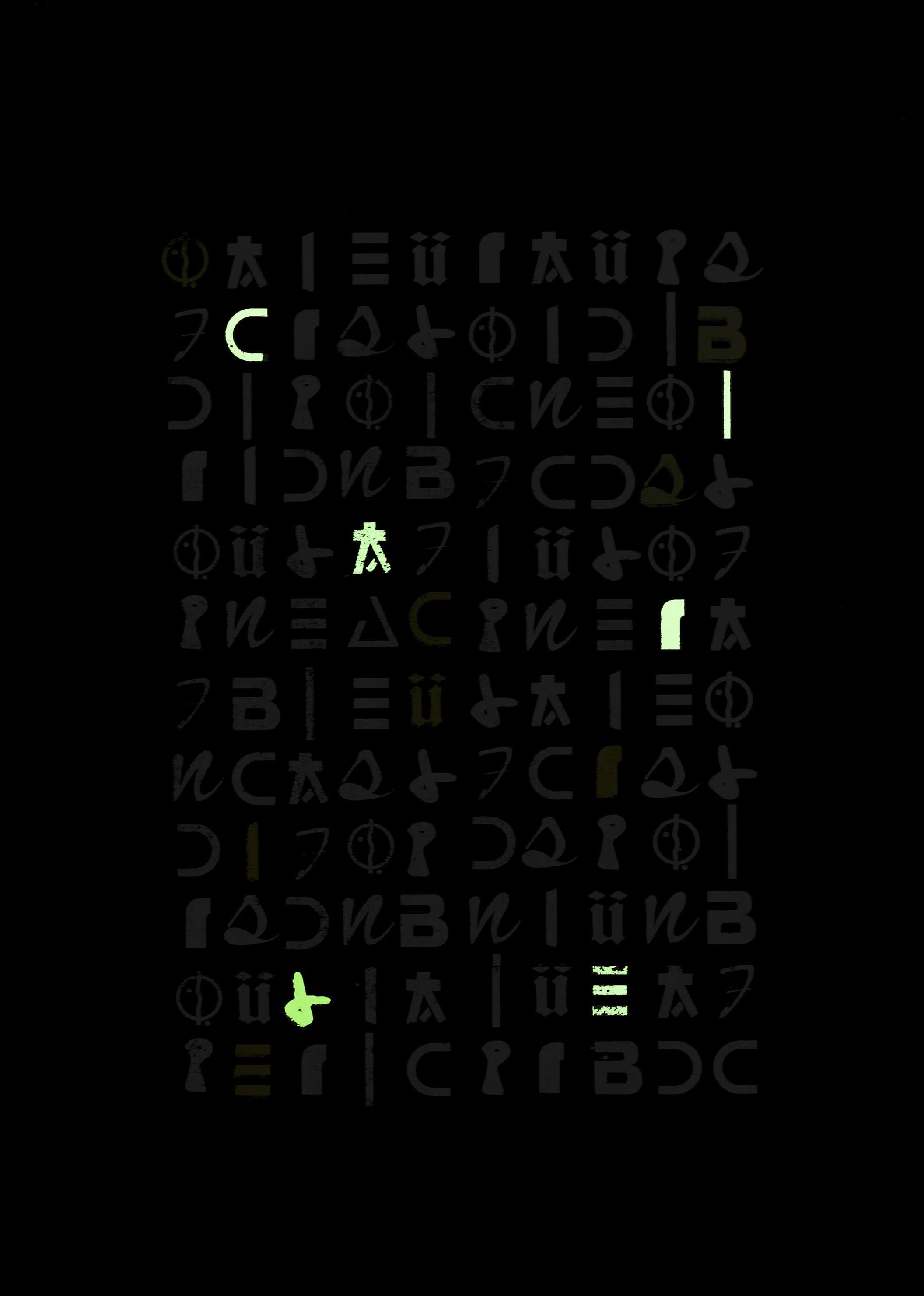
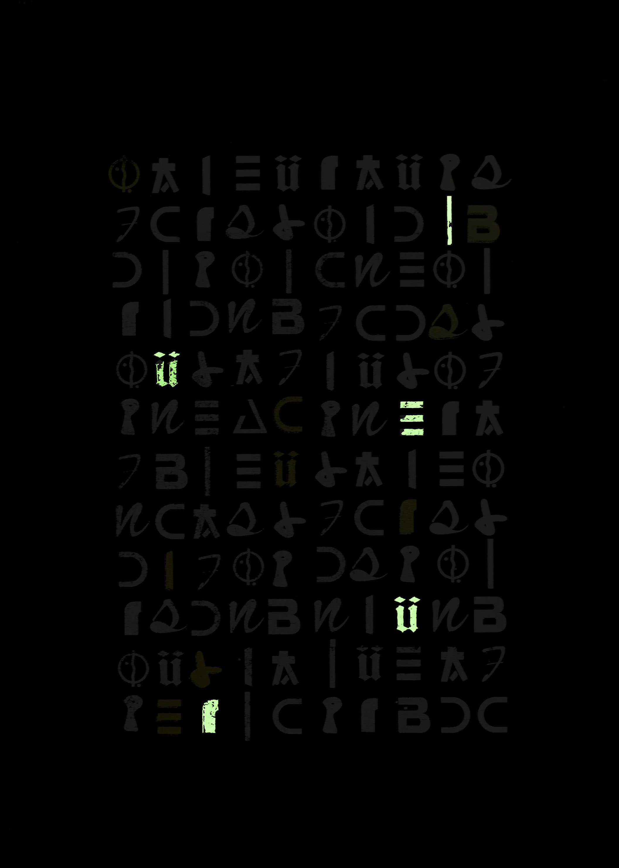
Our urban environment is overflowing with a lot of signs or shapes as different as each others. They are often recognizable but it's possible to make them unidentifiable if we remove them from their original set. So, I started to collect a lot of typographic character from commercial signs in order to create a database, an alphabet with various style. Oxymore is a series of posters which aim a new identity to these signs by mixing them like hieroglyphics and giving the project a double level of reading. In order to accentuate this idea, I used phosphorescent ink to print these posters because it allows me to create a link between two dimensions, in light and in obscurity.
2017
Conception and print : Christophe Léon
Dimension : 500 x 650 mm
Paper : Canson Mi-teintes 160g/m²
Print : Serigraphie with white, gold and phosphorescent ink


